Modernizing
Traffic Management
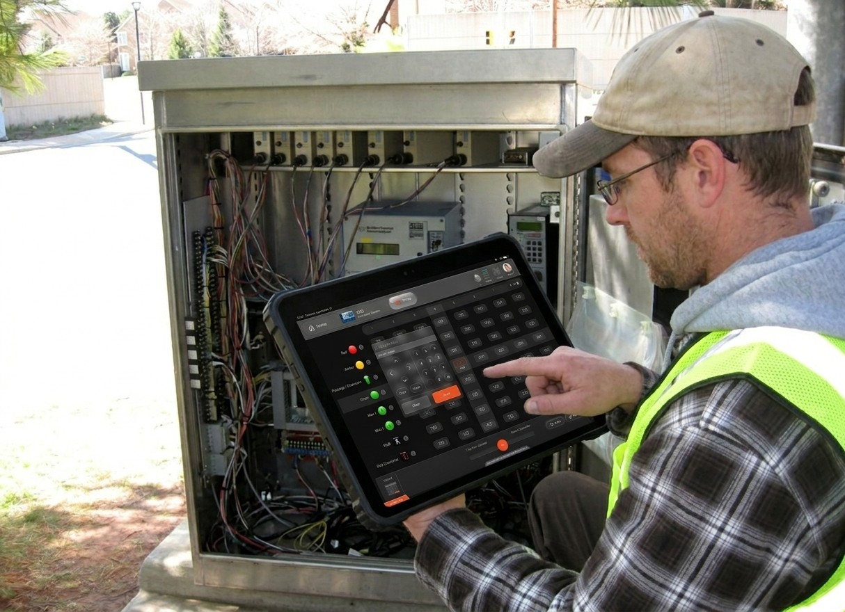
FENYX is a universal, intuitive digital interface designed to replace legacy manual tasks and streamline operations across Traffic Management Centers and field operators.

Client
Fortran Traffic Systems
Year
2022 - 2024
Role
PRODUCT DESIGNer
Deliverables
Hi-Fi Design Prototypes
UI Components
User Onboarding Guide
"The entire design process was backed by key stakeholders from TMC Durham Region and TMC Waterloo Region. Designing for both central operators and field technicians meant balancing complex feature depth with extreme ease of use. creating an intuitive interface tailored to different environments, hardware constraints, and levels of tech-savviness"
PROBLEM
Where Every Second Is Lost to the System, Not the Situation
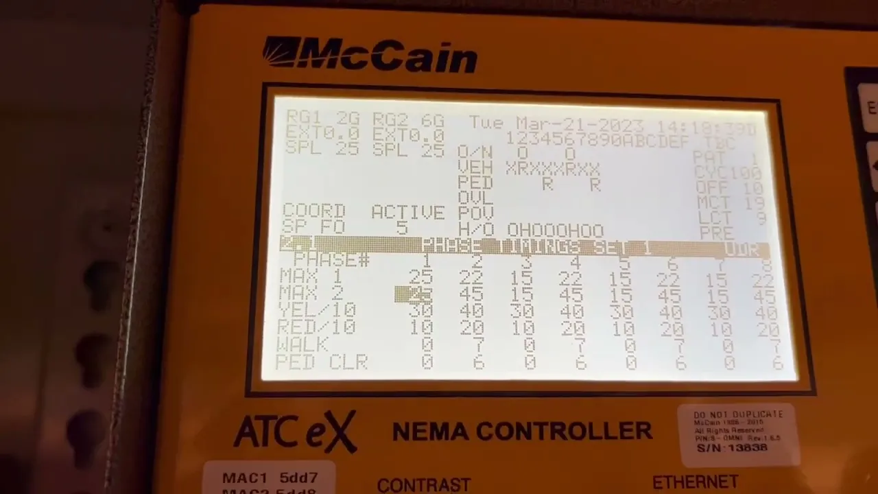
Across many municipalities in Canada, Traffic field operators are forced to manage high-stakes traffic events using outdated, legacy terminals and manual paper logs. This friction causes severe cognitive strain, introduces data entry errors, and slows down emergency response times.
FENYX was built to bridge this gap, delivering an affordable, modern, and intuitive digital interface that simplifies operations on the ground.
Legacy Friction:
Field operators in smaller municipalities rely on clunky legacy terminals and paper logs, forcing slow manual data entry under high-stress conditions.
Physical & Cognitive Fatigue:
Poorly designed interfaces require excessive screen-switching and cause visual strain, increasing the risk of operator error during critical traffic events.
The Equity Gap:
Smaller and underserved communities are left behind by expensive, overly complex enterprise software, leaving field teams stuck with ineffective, outdated setups.



the Solution
One Interface, Every Terminal
FENYX bridges the gap in modern traffic management by replacing disparate, brand-locked hardware setups with a single, device-agnostic interface. Designed to work over wired or Wi-Fi connections, FENYX brings intuitive digital control to field operators in municipalities of any budget size.
Vendor-Agnostic Interface (Universal Compatibility):
Eliminated the need for operators to learn multiple proprietary software systems by designing a single, unified UI that controls any traffic controller brand.
Dynamic Connectivity (Wired & Wi-Fi):
Built a responsive feedback system that gives operators real-time status visibility and continuous control, whether connected right at the cabinet or remotely via local Wi-Fi.
Frictionless Accessibility:
Designed a lightweight, highly intuitive digital experience tailored for smaller municipalities—reducing training time from weeks to minutes without requiring costly hardware overhauls.

Framing Scope and Reducing Risk Early
Where Operator Needs, Business Goals, and Backend Reality Meet
Pulling in operator needs, technical constraints, and business priorities before committing to a direction.
Mapping core workflows
I pinpointed two non negotiable operational priorities, simplifying complex configurations and streamlining controller profile management including real time, high volume data transfer.
Establishing Engineering Feasibility
I worked directly with development leads from day one to audit legacy constraints, ensuring our proposed UI patterns aligned with backend system capabilities.
Validating with Field Operators
Tested early concepts with traffic analysts and field technicians to validate task speed, clarity, and real world usability.


Discovery & Alignment
Aligning Top Down Vision with
Ground Level Friction
I kicked off the discovery phase alongside the Director of Product and senior leadership to align on business objectives, target outcomes, and technical parameters. While leadership brought a clear vision of what they wanted to build, real-world product development is rarely linear. I adapted our design process to balance executive goals with technical feasibility and real user friction ensuring we stayed agile without losing sight of the core user problem.

COncept validation
From Pixels to Proof
I designed high-fidelity UI and workflows and partnered closely with engineers, contributing to frontend implementation using React, TypeScript, and MUI. The solution was validated with leadership and municipal stakeholders and showcased at ITS Canada 2023, where it drew strong engagement.
This step mattered on two fronts:
For the business, it turned assumptions into evidence, validating direction with real stakeholders before deeper investment reduced risk and sharpened priorities heading into full development.
For me, it was the first real test of whether the design held up outside a Figma file. Seeing operators interact with a working interface gave me honest, immediate feedback that no amount of internal review could have replicated.
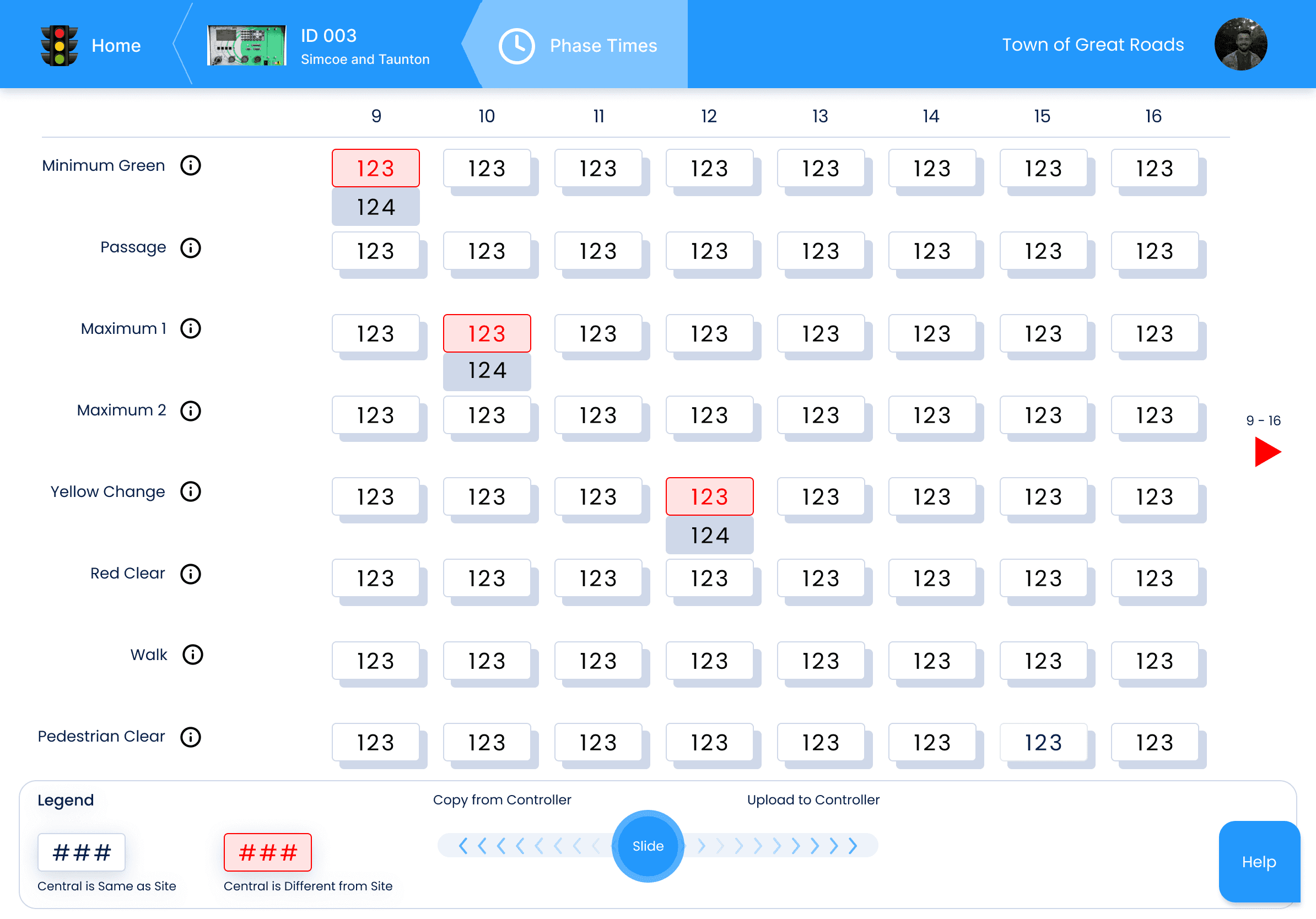
system ARCHITECTURE
Thinking Like an Operator to
Design Like One
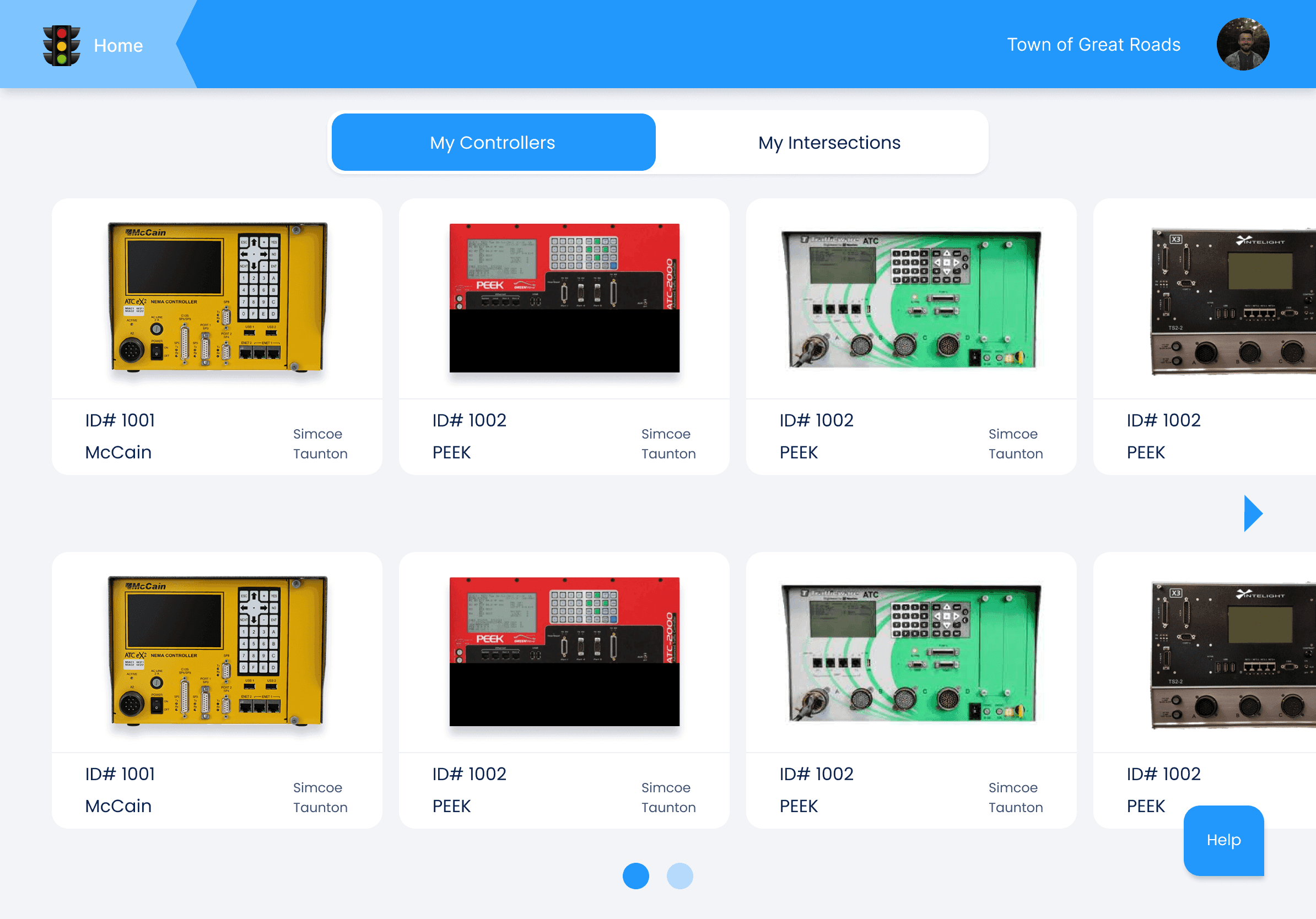
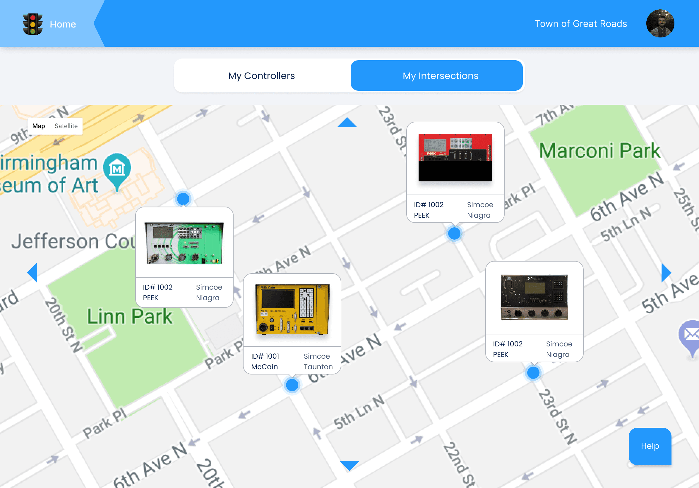
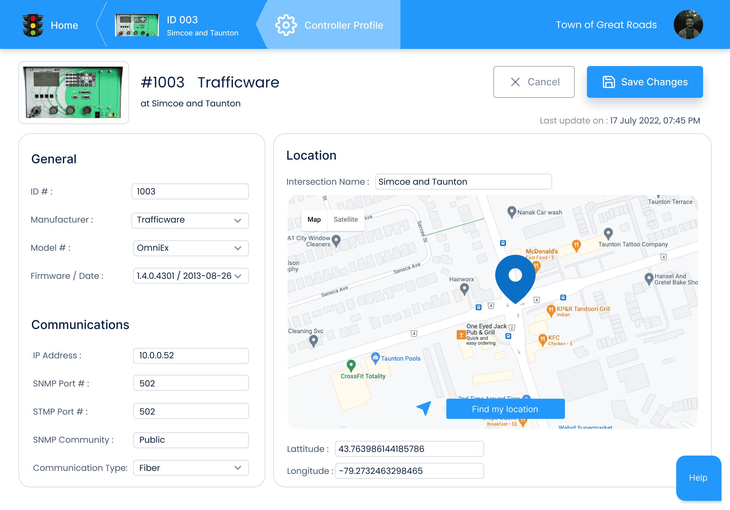
Each module; Controller Profile, Preemption, Phase Times, Phase Options felt like learning an entirely new subject before I could even begin designing for it. I spent significant time studying NTCIP (National Transportation Communications for Intelligent Transportation System (ITS) Protocol) standards and controller behaviour, and mapping out an operator's real day-to-day workflow to understand which modules mattered most and which caused the most friction.
That research shaped a modular design framework flexible enough to handle each module's unique logic while staying consistent across the system. Getting there took many iterations, refining flows and interactions with field operators until the underlying complexity was fully abstracted away. The interface was then elevated with a cohesive glass design system, featuring native light and dark mode support.


HIGHLIGHTS
Details That Make the Difference
Beyond the core workflows, I included a set of purpose built features designed to remove everyday friction for field operators. The intent behind each one was simplicity, straightforward interactions that required little to no learning curve, so operators could adapt quickly without added training or onboarding time.
Each feature targets a specific pain point, cutting down manual steps, reducing time-on-task, and keeping operators focused on the situation at hand rather than the tool in front of them.
Generic Tools in the App Bar
Queue, Copy, and Import/Export are used across every module, not specific to one. Placing them at the app bar level (instead of duplicating them inside each module) reduced redundancy and kept muscle memory consistent
Modular Design
Each module has different logic and complexity, but operators shouldn't have to relearn the interface every time. Modularity let me standardize patterns without flattening real differences between modules.
Step-by-Step Setup
Modules like Preemption, Times, Options, etc had the most interdependent settings and the highest error risk. Breaking it into a guided sequence reduced cognitive load and prevented operators from missing a critical step under pressure.
A Single Gesture for a Massive Transfer
A single swipe transfers bulk configuration data to or from the controller, replacing a multi-step, manual process with one fast, reliable gesture.
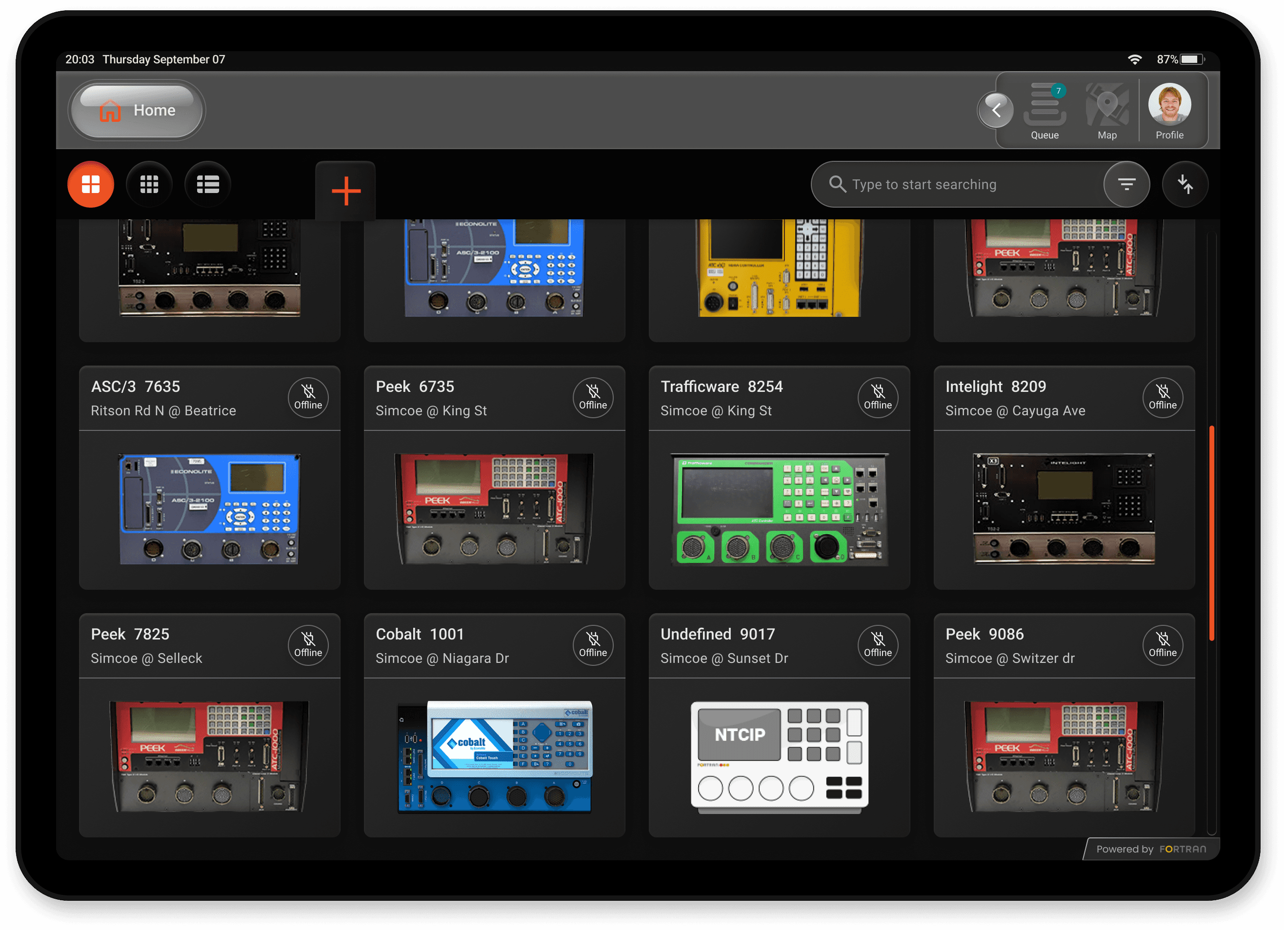
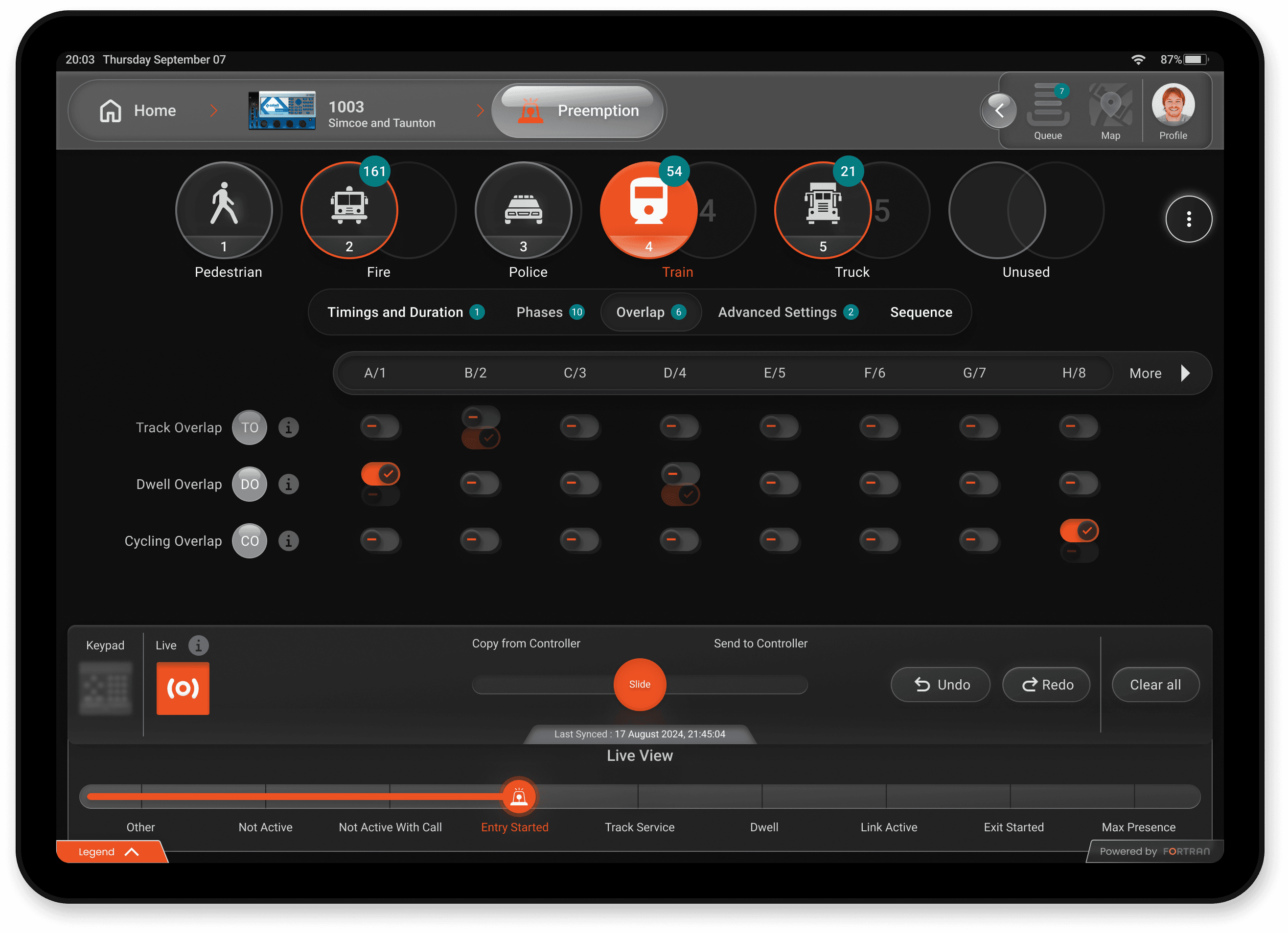
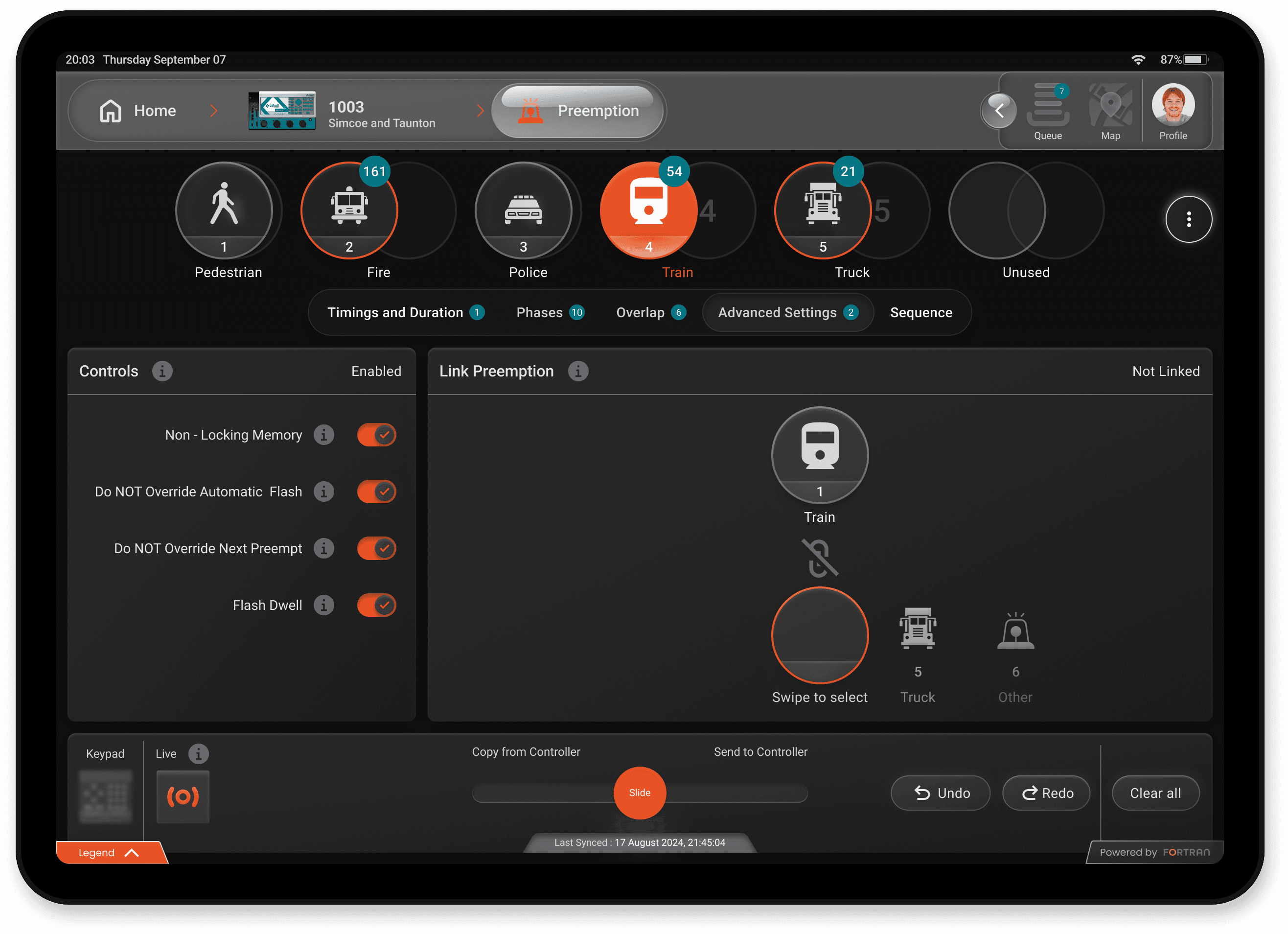
Hi-Fi SCREENS
The Result of Every Decision
Before This
After crafting detailed and user centered designs, I collaborated closely with the engineering team to ensure a seamless transition from concept to implementation. Beyond handing off the designs, I actively participated in the development process by assisting in building components and layouts that aligned perfectly with the design specifications. By bridging the gap between design and development, I streamlined workflows, reduced iteration cycles, and enhanced the efficiency of the engineering team. This hands-on approach not only ensured design fidelity but also accelerated the overall development timeline, driving the project toward successful delivery.
FINAL CALL
The Wins, and What They Taught Me
The FENYX app achieved exceptional results, redefining user expectations while maintaining simplicity and usability across various controllers.
Winning moments
Overall Task Success Rate: 92% Users successfully completed assigned tasks with minimal guidance.
Average Task Completion Time: 3.2 minutes per task: Tasks were completed efficiently, showcasing the app's ease of use.
Unanimously Positive User Feedback: Some users were so impressed that they doubted a single interface could work seamlessly for all controllers.
Innovative Controller Management: The app introduced a fresh and unique way to configure and manage controllers, setting a new standard in the industry.
UX Psychology Principles: Designed with familiar yet dynamic patterns combining slight complexity to engage users with a friendly, intuitive interface leveraging learned behaviours while encouraging exploration.
LESSONS
Adapting to Diverse Needs: Addressing a wide spectrum of user requirements reinforced the importance of balancing simplicity with advanced functionality.
Stakeholder Collaboration: Managing diverse expectations from engineering, design, and end-users required continuous alignment but drove better results.
Iterate to Innovate: Embracing iterations and user feedback was critical in refining the design to achieve success across multiple use cases.
Unified Experience Matters: A single interface for multiple controllers requires innovative thinking but ultimately creates a superior user experience.

from this
to this
Modernizing
Traffic Management
FENYX is a universal, intuitive digital interface designed to replace legacy manual tasks and streamline operations across Traffic Management Centers and field operators.
Client
Fortran Traffic Systems
Year
2022 - 2024
Role
PRODUCT DESIGNer
Deliverables
Hi-Fi Design Prototypes
UI Components
User Onboarding Guide
"The entire design process was backed by key stakeholders from TMC Durham Region and TMC Waterloo Region. Designing for both central operators and field technicians meant balancing complex feature depth with extreme ease of use. creating an intuitive interface tailored to different environments, hardware constraints, and levels of tech-savviness"
PROBLEM
Where Every Second Is Lost to the System, Not the Situation
Across many municipalities in Canada, Traffic field operators are forced to manage high-stakes traffic events using outdated, legacy terminals and manual paper logs. This friction causes severe cognitive strain, introduces data entry errors, and slows down emergency response times.
FENYX was built to bridge this gap, delivering an affordable, modern, and intuitive digital interface that simplifies operations on the ground.
Legacy Friction:
Field operators in smaller municipalities rely on clunky legacy terminals and paper logs, forcing slow manual data entry under high-stress conditions.
Physical & Cognitive Fatigue:
Poorly designed interfaces require excessive screen-switching and cause visual strain, increasing the risk of operator error during critical traffic events.
The Equity Gap:
Smaller and underserved communities are left behind by expensive, overly complex enterprise software, leaving field teams stuck with ineffective, outdated setups.
the Solution
One Interface, Every Terminal
FENYX bridges the gap in modern traffic management by replacing disparate, brand-locked hardware setups with a single, device-agnostic interface. Designed to work over wired or Wi-Fi connections, FENYX brings intuitive digital control to field operators in municipalities of any budget size.
Vendor-Agnostic Interface (Universal Compatibility):
Eliminated the need for operators to learn multiple proprietary software systems by designing a single, unified UI that controls any traffic controller brand.
Dynamic Connectivity (Wired & Wi-Fi):
Built a responsive feedback system that gives operators real-time status visibility and continuous control, whether connected right at the cabinet or remotely via local Wi-Fi.
Frictionless Accessibility:
Designed a lightweight, highly intuitive digital experience tailored for smaller municipalities—reducing training time from weeks to minutes without requiring costly hardware overhauls.
Framing Scope and Reducing Risk Early
Where Operator Needs, Business Goals, and Backend Reality Meet
Pulling in operator needs, technical constraints, and business priorities before committing to a direction.
Mapping core workflows
I pinpointed two non negotiable operational priorities, simplifying complex configurations and streamlining controller profile management including real time, high volume data transfer.
Establishing Engineering Feasibility
I worked directly with development leads from day one to audit legacy constraints, ensuring our proposed UI patterns aligned with backend system capabilities.
Validating with Field Operators
Tested early concepts with traffic analysts and field technicians to validate task speed, clarity, and real world usability.
Discovery & Alignment
Aligning Top Down Vision with
Ground Level Friction
I kicked off the discovery phase alongside the Director of Product and senior leadership to align on business objectives, target outcomes, and technical parameters. While leadership brought a clear vision of what they wanted to build, real-world product development is rarely linear. I adapted our design process to balance executive goals with technical feasibility and real user friction ensuring we stayed agile without losing sight of the core user problem.
COncept validation
From Pixels to Proof
I designed high-fidelity UI and workflows and partnered closely with engineers, contributing to frontend implementation using React, TypeScript, and MUI. The solution was validated with leadership and municipal stakeholders and showcased at ITS Canada 2023, where it drew strong engagement.
This step mattered on two fronts:
For the business, it turned assumptions into evidence, validating direction with real stakeholders before deeper investment reduced risk and sharpened priorities heading into full development.
For me, it was the first real test of whether the design held up outside a Figma file. Seeing operators interact with a working interface gave me honest, immediate feedback that no amount of internal review could have replicated.
system ARCHITECTURE
Thinking Like an Operator to
Design Like One
Each module; Controller Profile, Preemption, Phase Times, Phase Options felt like learning an entirely new subject before I could even begin designing for it. I spent significant time studying NTCIP (National Transportation Communications for Intelligent Transportation System (ITS) Protocol) standards and controller behaviour, and mapping out an operator's real day-to-day workflow to understand which modules mattered most and which caused the most friction.
That research shaped a modular design framework flexible enough to handle each module's unique logic while staying consistent across the system. Getting there took many iterations, refining flows and interactions with field operators until the underlying complexity was fully abstracted away. The interface was then elevated with a cohesive glass design system, featuring native light and dark mode support.
HIGHLIGHTS
Details That Make the Difference
Beyond the core workflows, I included a set of purpose built features designed to remove everyday friction for field operators. The intent behind each one was simplicity, straightforward interactions that required little to no learning curve, so operators could adapt quickly without added training or onboarding time.
Each feature targets a specific pain point, cutting down manual steps, reducing time-on-task, and keeping operators focused on the situation at hand rather than the tool in front of them.
Generic Tools in the App Bar
Queue, Copy, and Import/Export are used across every module, not specific to one. Placing them at the app bar level (instead of duplicating them inside each module) reduced redundancy and kept muscle memory consistent
Modular Design
Each module has different logic and complexity, but operators shouldn't have to relearn the interface every time. Modularity let me standardize patterns without flattening real differences between modules.
Step-by-Step Setup
Modules like Preemption, Times, Options, etc had the most interdependent settings and the highest error risk. Breaking it into a guided sequence reduced cognitive load and prevented operators from missing a critical step under pressure.
A Single Gesture for a Massive Transfer
A single swipe transfers bulk configuration data to or from the controller, replacing a multi-step, manual process with one fast, reliable gesture.
Hi-Fi SCREENS
The Result of Every Decision
Before This
After crafting detailed and user centered designs, I collaborated closely with the engineering team to ensure a seamless transition from concept to implementation. Beyond handing off the designs, I actively participated in the development process by assisting in building components and layouts that aligned perfectly with the design specifications. By bridging the gap between design and development, I streamlined workflows, reduced iteration cycles, and enhanced the efficiency of the engineering team. This hands-on approach not only ensured design fidelity but also accelerated the overall development timeline, driving the project toward successful delivery.
FINAL CALL
The Wins, and What They Taught Me
The FENYX app achieved exceptional results, redefining user expectations while maintaining simplicity and usability across various controllers.
Winning moments
Overall Task Success Rate: 92% Users successfully completed assigned tasks with minimal guidance.
Average Task Completion Time: 3.2 minutes per task: Tasks were completed efficiently, showcasing the app's ease of use.
Unanimously Positive User Feedback: Some users were so impressed that they doubted a single interface could work seamlessly for all controllers.
Innovative Controller Management: The app introduced a fresh and unique way to configure and manage controllers, setting a new standard in the industry.
UX Psychology Principles: Designed with familiar yet dynamic patterns combining slight complexity to engage users with a friendly, intuitive interface leveraging learned behaviours while encouraging exploration.
LESSONS
Adapting to Diverse Needs: Addressing a wide spectrum of user requirements reinforced the importance of balancing simplicity with advanced functionality.
Stakeholder Collaboration: Managing diverse expectations from engineering, design, and end-users required continuous alignment but drove better results.
Iterate to Innovate: Embracing iterations and user feedback was critical in refining the design to achieve success across multiple use cases.
Unified Experience Matters: A single interface for multiple controllers requires innovative thinking but ultimately creates a superior user experience.
from this
to this
Modernizing
Traffic Management
FENYX is a universal, intuitive digital interface designed to replace legacy manual tasks and streamline operations across Traffic Management Centers and field operators.
Client
Fortran Traffic Systems
Year
2022 - 2024
Role
PRODUCT DESIGNer
Deliverables
Hi-Fi Design Prototypes
UI Components
User Onboarding Guide
"The entire design process was backed by key stakeholders from TMC Durham Region and TMC Waterloo Region. Designing for both central operators and field technicians meant balancing complex feature depth with extreme ease of use. creating an intuitive interface tailored to different environments, hardware constraints, and levels of tech-savviness"
PROBLEM
Where Every Second Is Lost to the System, Not the Situation
Across many municipalities in Canada, Traffic field operators are forced to manage high-stakes traffic events using outdated, legacy terminals and manual paper logs. This friction causes severe cognitive strain, introduces data entry errors, and slows down emergency response times.
FENYX was built to bridge this gap, delivering an affordable, modern, and intuitive digital interface that simplifies operations on the ground.
Legacy Friction:
Field operators in smaller municipalities rely on clunky legacy terminals and paper logs, forcing slow manual data entry under high-stress conditions.
Physical & Cognitive Fatigue:
Poorly designed interfaces require excessive screen-switching and cause visual strain, increasing the risk of operator error during critical traffic events.
The Equity Gap:
Smaller and underserved communities are left behind by expensive, overly complex enterprise software, leaving field teams stuck with ineffective, outdated setups.
the Solution
One Interface, Every Terminal
FENYX bridges the gap in modern traffic management by replacing disparate, brand-locked hardware setups with a single, device-agnostic interface. Designed to work over wired or Wi-Fi connections, FENYX brings intuitive digital control to field operators in municipalities of any budget size.
Vendor-Agnostic Interface (Universal Compatibility):
Eliminated the need for operators to learn multiple proprietary software systems by designing a single, unified UI that controls any traffic controller brand.
Dynamic Connectivity (Wired & Wi-Fi):
Built a responsive feedback system that gives operators real-time status visibility and continuous control, whether connected right at the cabinet or remotely via local Wi-Fi.
Frictionless Accessibility:
Designed a lightweight, highly intuitive digital experience tailored for smaller municipalities—reducing training time from weeks to minutes without requiring costly hardware overhauls.
Framing Scope and Reducing Risk Early
Where Operator Needs, Business Goals, and Backend Reality Meet
Pulling in operator needs, technical constraints, and business priorities before committing to a direction.
Mapping core workflows
I pinpointed two non negotiable operational priorities, simplifying complex configurations and streamlining controller profile management including real time, high volume data transfer.
Establishing Engineering Feasibility
I worked directly with development leads from day one to audit legacy constraints, ensuring our proposed UI patterns aligned with backend system capabilities.
Validating with Field Operators
Tested early concepts with traffic analysts and field technicians to validate task speed, clarity, and real world usability.
Discovery &
Alignment
Aligning Top Down Vision with Ground Level Friction
I kicked off the discovery phase alongside the Director of Product and senior leadership to align on business objectives, target outcomes, and technical parameters. While leadership brought a clear vision of what they wanted to build, real-world product development is rarely linear. I adapted our design process to balance executive goals with technical feasibility and real user friction ensuring we stayed agile without losing sight of the core user problem.
COncept validation
From Pixels to Proof
I designed high-fidelity UI and workflows and partnered closely with engineers, contributing to frontend implementation using React, TypeScript, and MUI. The solution was validated with leadership and municipal stakeholders and showcased at ITS Canada 2023, where it drew strong engagement.
This step mattered on two fronts:
For the business, it turned assumptions into evidence, validating direction with real stakeholders before deeper investment reduced risk and sharpened priorities heading into full development.
For me, it was the first real test of whether the design held up outside a Figma file. Seeing operators interact with a working interface gave me honest, immediate feedback that no amount of internal review could have replicated.
system ARCHITECTURE
Thinking Like an Operator to
Design Like One
Each module; Controller Profile, Preemption, Phase Times, Phase Options felt like learning an entirely new subject before I could even begin designing for it. I spent significant time studying NTCIP (National Transportation Communications for Intelligent Transportation System (ITS) Protocol) standards and controller behaviour, and mapping out an operator's real day-to-day workflow to understand which modules mattered most and which caused the most friction.
That research shaped a modular design framework flexible enough to handle each module's unique logic while staying consistent across the system. Getting there took many iterations, refining flows and interactions with field operators until the underlying complexity was fully abstracted away. The interface was then elevated with a cohesive glass design system, featuring native light and dark mode support.
HIGHLIGHTS
Details That Make the Difference
Beyond the core workflows, I included a set of purpose built features designed to remove everyday friction for field operators. The intent behind each one was simplicity, straightforward interactions that required little to no learning curve, so operators could adapt quickly without added training or onboarding time.
Each feature targets a specific pain point, cutting down manual steps, reducing time-on-task, and keeping operators focused on the situation at hand rather than the tool in front of them.
Generic Tools in the App Bar
Queue, Copy, and Import/Export are used across every module, not specific to one. Placing them at the app bar level (instead of duplicating them inside each module) reduced redundancy and kept muscle memory consistent
Modular Design
Each module has different logic and complexity, but operators shouldn't have to relearn the interface every time. Modularity let me standardize patterns without flattening real differences between modules.
Step-by-Step Setup
Modules like Preemption, Times, Options, etc had the most interdependent settings and the highest error risk. Breaking it into a guided sequence reduced cognitive load and prevented operators from missing a critical step under pressure.
A Single Gesture for a Massive Transfer
A single swipe transfers bulk configuration data to or from the controller, replacing a multi-step, manual process with one fast, reliable gesture.
Hi-Fi SCREENS
The Result of
Every Decision
Before This
After crafting detailed and user centered designs, I collaborated closely with the engineering team to ensure a seamless transition from concept to implementation. Beyond handing off the designs, I actively participated in the development process by assisting in building components and layouts that aligned perfectly with the design specifications. By bridging the gap between design and development, I streamlined workflows, reduced iteration cycles, and enhanced the efficiency of the engineering team. This hands-on approach not only ensured design fidelity but also accelerated the overall development timeline, driving the project toward successful delivery.
FINAL CALL
The Wins, and
What They Taught Me
The FENYX app achieved exceptional results, redefining user expectations while maintaining simplicity and usability across various controllers.
Winning moments
Overall Task Success Rate: 92% Users successfully completed assigned tasks with minimal guidance.
Average Task Completion Time: 3.2 minutes per task: Tasks were completed efficiently, showcasing the app's ease of use.
Unanimously Positive User Feedback: Some users were so impressed that they doubted a single interface could work seamlessly for all controllers.
Innovative Controller Management: The app introduced a fresh and unique way to configure and manage controllers, setting a new standard in the industry.
UX Psychology Principles: Designed with familiar yet dynamic patterns combining slight complexity to engage users with a friendly, intuitive interface leveraging learned behaviours while encouraging exploration.
LESSONS
Adapting to Diverse Needs: Addressing a wide spectrum of user requirements reinforced the importance of balancing simplicity with advanced functionality.
Stakeholder Collaboration: Managing diverse expectations from engineering, design, and end-users required continuous alignment but drove better results.
Iterate to Innovate: Embracing iterations and user feedback was critical in refining the design to achieve success across multiple use cases.
Unified Experience Matters: A single interface for multiple controllers requires innovative thinking but ultimately creates a superior user experience.
from this
to this
Modernizing
Traffic Management
FENYX is a universal, intuitive digital interface designed to replace legacy manual tasks and streamline operations across Traffic Management Centers and field operators.
Client
Fortran Traffic Systems
Year
2022 - 2024
Role
PRODUCT DESIGNer
Deliverables
Hi-Fi Design Prototypes
UI Components
User Onboarding Guide
"The entire design process was backed by key stakeholders from TMC Durham Region and TMC Waterloo Region. Designing for both central operators and field technicians meant balancing complex feature depth with extreme ease of use. creating an intuitive interface tailored to different environments, hardware constraints, and levels of tech-savviness"
PROBLEM
Where Every Second Is Lost to the System, Not the Situation
Across many municipalities in Canada, Traffic field operators are forced to manage high-stakes traffic events using outdated, legacy terminals and manual paper logs. This friction causes severe cognitive strain, introduces data entry errors, and slows down emergency response times.
FENYX was built to bridge this gap, delivering an affordable, modern, and intuitive digital interface that simplifies operations on the ground.
Legacy Friction:
Field operators in smaller municipalities rely on clunky legacy terminals and paper logs, forcing slow manual data entry under high-stress conditions.
Physical & Cognitive Fatigue:
Poorly designed interfaces require excessive screen-switching and cause visual strain, increasing the risk of operator error during critical traffic events.
The Equity Gap:
Smaller and underserved communities are left behind by expensive, overly complex enterprise software, leaving field teams stuck with ineffective, outdated setups.
the Solution
One Interface, Every Terminal
FENYX bridges the gap in modern traffic management by replacing disparate, brand-locked hardware setups with a single, device-agnostic interface. Designed to work over wired or Wi-Fi connections, FENYX brings intuitive digital control to field operators in municipalities of any budget size.
Vendor-Agnostic Interface (Universal Compatibility):
Eliminated the need for operators to learn multiple proprietary software systems by designing a single, unified UI that controls any traffic controller brand.
Dynamic Connectivity (Wired & Wi-Fi):
Built a responsive feedback system that gives operators real-time status visibility and continuous control, whether connected right at the cabinet or remotely via local Wi-Fi.
Frictionless Accessibility:
Designed a lightweight, highly intuitive digital experience tailored for smaller municipalities—reducing training time from weeks to minutes without requiring costly hardware overhauls.
Framing Scope and Reducing Risk Early
Where Operator Needs, Business Goals, and Backend Reality Meet
Pulling in operator needs, technical constraints, and business priorities before committing to a direction.
Mapping core workflows
I pinpointed two non negotiable operational priorities, simplifying complex configurations and streamlining controller profile management including real time, high volume data transfer.
Establishing Engineering Feasibility
I worked directly with development leads from day one to audit legacy constraints, ensuring our proposed UI patterns aligned with backend system capabilities.
Validating with Field Operators
Tested early concepts with traffic analysts and field technicians to validate task speed, clarity, and real world usability.
Discovery & Alignment
Aligning Top Down Vision with
Ground Level Friction
I kicked off the discovery phase alongside the Director of Product and senior leadership to align on business objectives, target outcomes, and technical parameters. While leadership brought a clear vision of what they wanted to build, real-world product development is rarely linear. I adapted our design process to balance executive goals with technical feasibility and real user friction ensuring we stayed agile without losing sight of the core user problem.
COncept validation
From Pixels to Proof
I designed high-fidelity UI and workflows and partnered closely with engineers, contributing to frontend implementation using React, TypeScript, and MUI. The solution was validated with leadership and municipal stakeholders and showcased at ITS Canada 2023, where it drew strong engagement.
This step mattered on two fronts:
For the business, it turned assumptions into evidence, validating direction with real stakeholders before deeper investment reduced risk and sharpened priorities heading into full development.
For me, it was the first real test of whether the design held up outside a Figma file. Seeing operators interact with a working interface gave me honest, immediate feedback that no amount of internal review could have replicated.
system ARCHITECTURE
Thinking Like an Operator to
Design Like One
Each module; Controller Profile, Preemption, Phase Times, Phase Options felt like learning an entirely new subject before I could even begin designing for it. I spent significant time studying NTCIP (National Transportation Communications for Intelligent Transportation System (ITS) Protocol) standards and controller behaviour, and mapping out an operator's real day-to-day workflow to understand which modules mattered most and which caused the most friction.
That research shaped a modular design framework flexible enough to handle each module's unique logic while staying consistent across the system. Getting there took many iterations, refining flows and interactions with field operators until the underlying complexity was fully abstracted away. The interface was then elevated with a cohesive glass design system, featuring native light and dark mode support.
HIGHLIGHTS
Details That Make the Difference
Beyond the core workflows, I included a set of purpose built features designed to remove everyday friction for field operators. The intent behind each one was simplicity, straightforward interactions that required little to no learning curve, so operators could adapt quickly without added training or onboarding time.
Each feature targets a specific pain point, cutting down manual steps, reducing time-on-task, and keeping operators focused on the situation at hand rather than the tool in front of them.
Generic Tools in the App Bar
Queue, Copy, and Import/Export are used across every module, not specific to one. Placing them at the app bar level (instead of duplicating them inside each module) reduced redundancy and kept muscle memory consistent
Modular Design
Each module has different logic and complexity, but operators shouldn't have to relearn the interface every time. Modularity let me standardize patterns without flattening real differences between modules.
Step-by-Step Setup
Modules like Preemption, Times, Options, etc had the most interdependent settings and the highest error risk. Breaking it into a guided sequence reduced cognitive load and prevented operators from missing a critical step under pressure.
A Single Gesture for a Massive Transfer
A single swipe transfers bulk configuration data to or from the controller, replacing a multi-step, manual process with one fast, reliable gesture.
Hi-Fi SCREENS
The Result of Every Decision
Before This
After crafting detailed and user centered designs, I collaborated closely with the engineering team to ensure a seamless transition from concept to implementation. Beyond handing off the designs, I actively participated in the development process by assisting in building components and layouts that aligned perfectly with the design specifications. By bridging the gap between design and development, I streamlined workflows, reduced iteration cycles, and enhanced the efficiency of the engineering team. This hands-on approach not only ensured design fidelity but also accelerated the overall development timeline, driving the project toward successful delivery.
FINAL CALL
The Wins, and What They Taught Me
The FENYX app achieved exceptional results, redefining user expectations while maintaining simplicity and usability across various controllers.
Winning moments
Overall Task Success Rate: 92% Users successfully completed assigned tasks with minimal guidance.
Average Task Completion Time: 3.2 minutes per task: Tasks were completed efficiently, showcasing the app's ease of use.
Unanimously Positive User Feedback: Some users were so impressed that they doubted a single interface could work seamlessly for all controllers.
Innovative Controller Management: The app introduced a fresh and unique way to configure and manage controllers, setting a new standard in the industry.
UX Psychology Principles: Designed with familiar yet dynamic patterns combining slight complexity to engage users with a friendly, intuitive interface leveraging learned behaviours while encouraging exploration.
LESSONS
Adapting to Diverse Needs: Addressing a wide spectrum of user requirements reinforced the importance of balancing simplicity with advanced functionality.
Stakeholder Collaboration: Managing diverse expectations from engineering, design, and end-users required continuous alignment but drove better results.
Iterate to Innovate: Embracing iterations and user feedback was critical in refining the design to achieve success across multiple use cases.
Unified Experience Matters: A single interface for multiple controllers requires innovative thinking but ultimately creates a superior user experience.
from this
to this