Client:
Fortran Traffic Systems, 2022–2025
Partners:
TMC Durham Region and TMC Waterloo Region
Team:
4 engineers, a product director, and a sole designer.
My role:
Owned the design end to end (research, UX, design system, hi-fi prototypes, and an onboarding guide).
Built front-end components in React, TypeScript, and MUI.
Validated the build using Storybook.
Outcome:
92% task success rate with field operators
3.2-minute average task completion time, compared with 20–35 minutes for the manual process.
Demoed at ITS Canada 2023.
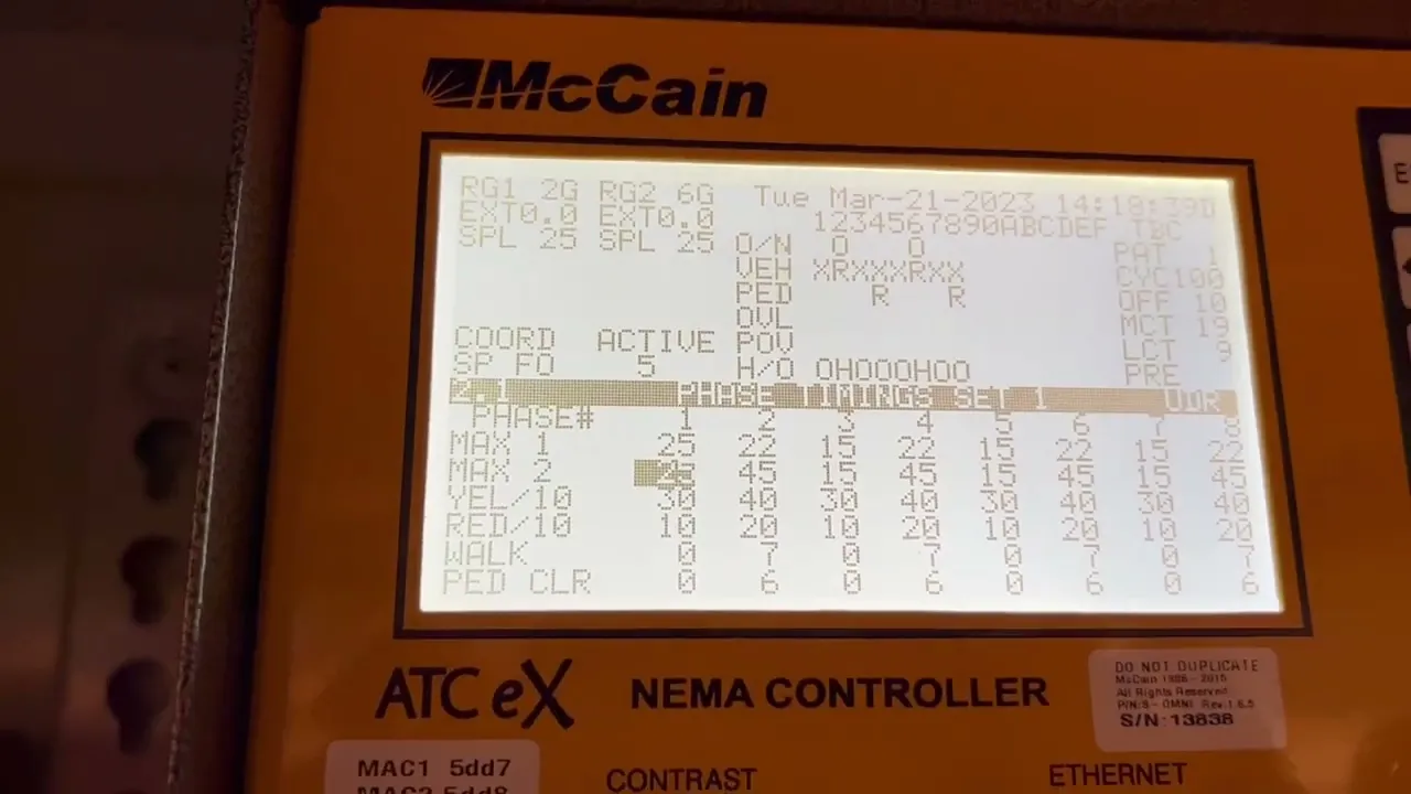
Every traffic controller brand ships with its own software, vocabulary, and ways to get a setting wrong. In smaller municipalities, that meant learning multiple proprietary tools or working from legacy terminals and paper logs. Fortran wanted one interface that could configure any controller and remain affordable for any budget. I owned its design from the first workshop to the components engineers shipped.


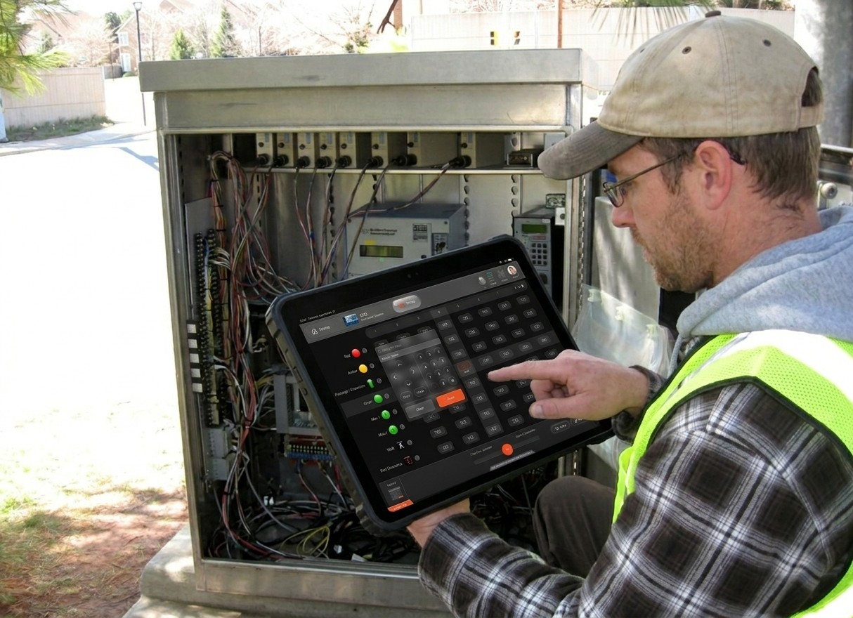
Fortran’s brief was focused: a portable web app for small and mid-sized municipalities that connects to the controller inside each street cabinet and uploads timing data sent from the traffic operations center.
Over more than ten sessions with product leadership, TMC stakeholders, and operators, the ask grew. People also wanted to set up a brand-new intersection, move the configuration from a dead controller to a replacement, and handle large volumes of configuration data, all in something easy enough to use while standing at a cabinet.
That changed the problem. A simple uploader would have covered the easy part of the job. What people described was a capable configuration tool that had to stay simple. That tension shaped every decision below.
Three principles guided the work:
One mental model across every vendor: An operator who learns one module has learned them all.
Make the risky thing hard and the common thing fast: Setup and bulk transfer touch live signals, so they get guidance and guardrails. Routine actions stay one step away.
Design for the field: operators work at a cabinet, on different hardware, in different environments, and with different levels of comfort with technology.

Before committing to a full design, I built an early-stage prototype and tested it with traffic analysts and field technicians. The question was simple: would operators accept one interface controlling controllers from different vendors, and could they complete core tasks like timing configuration and data transfer?
It confirmed the approach: several operators doubted a single interface could work across every controller until they used it.
This was also my first test of whether the design held up outside Figma. Watching operators use a working interface gave me feedback that internal review couldn’t. I then took the validated direction to leadership and municipal stakeholders, and later presented it at ITS Canada 2023.


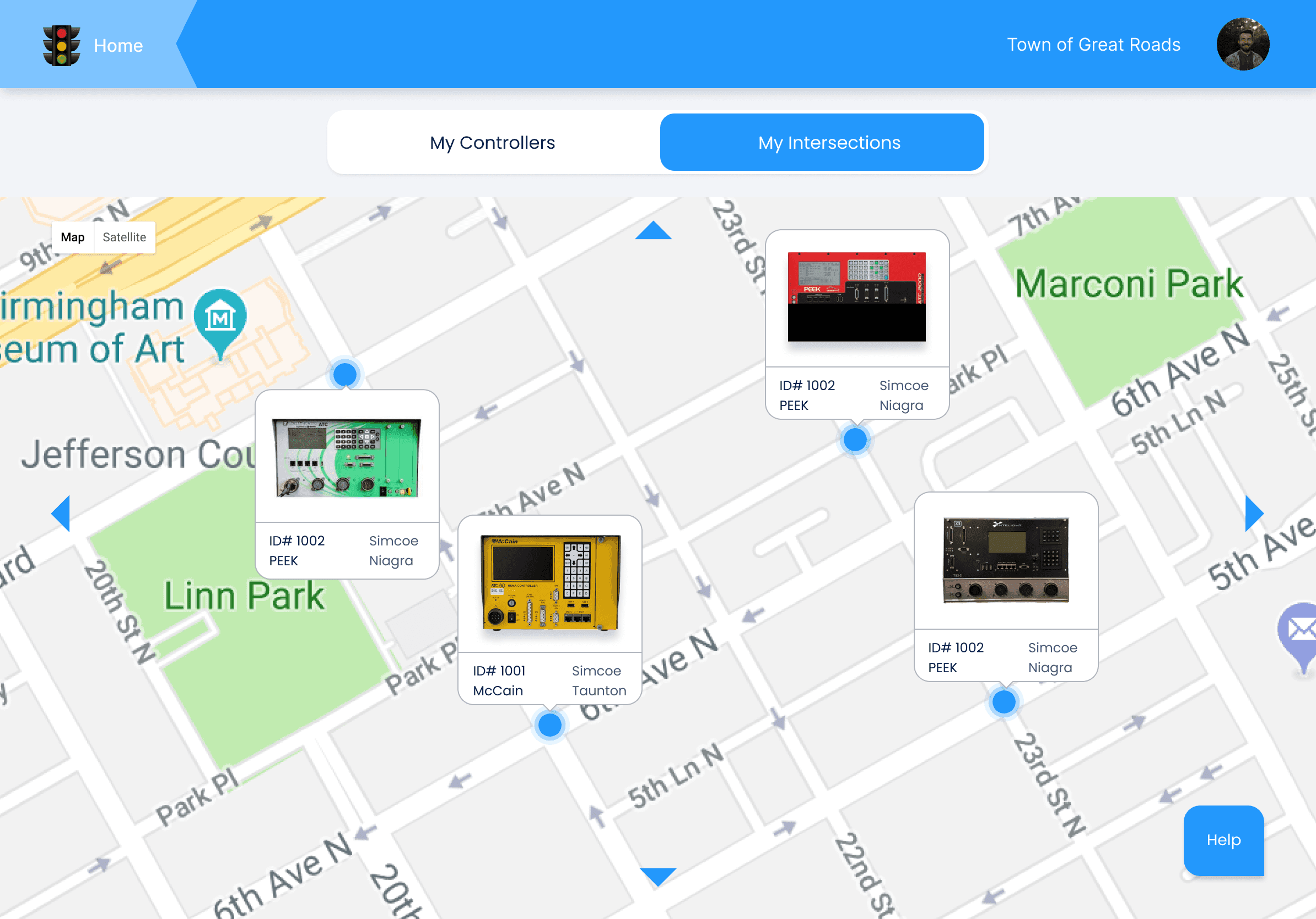
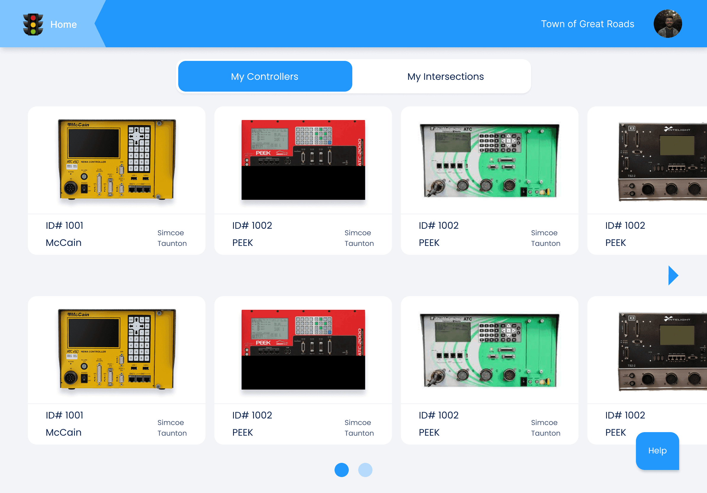
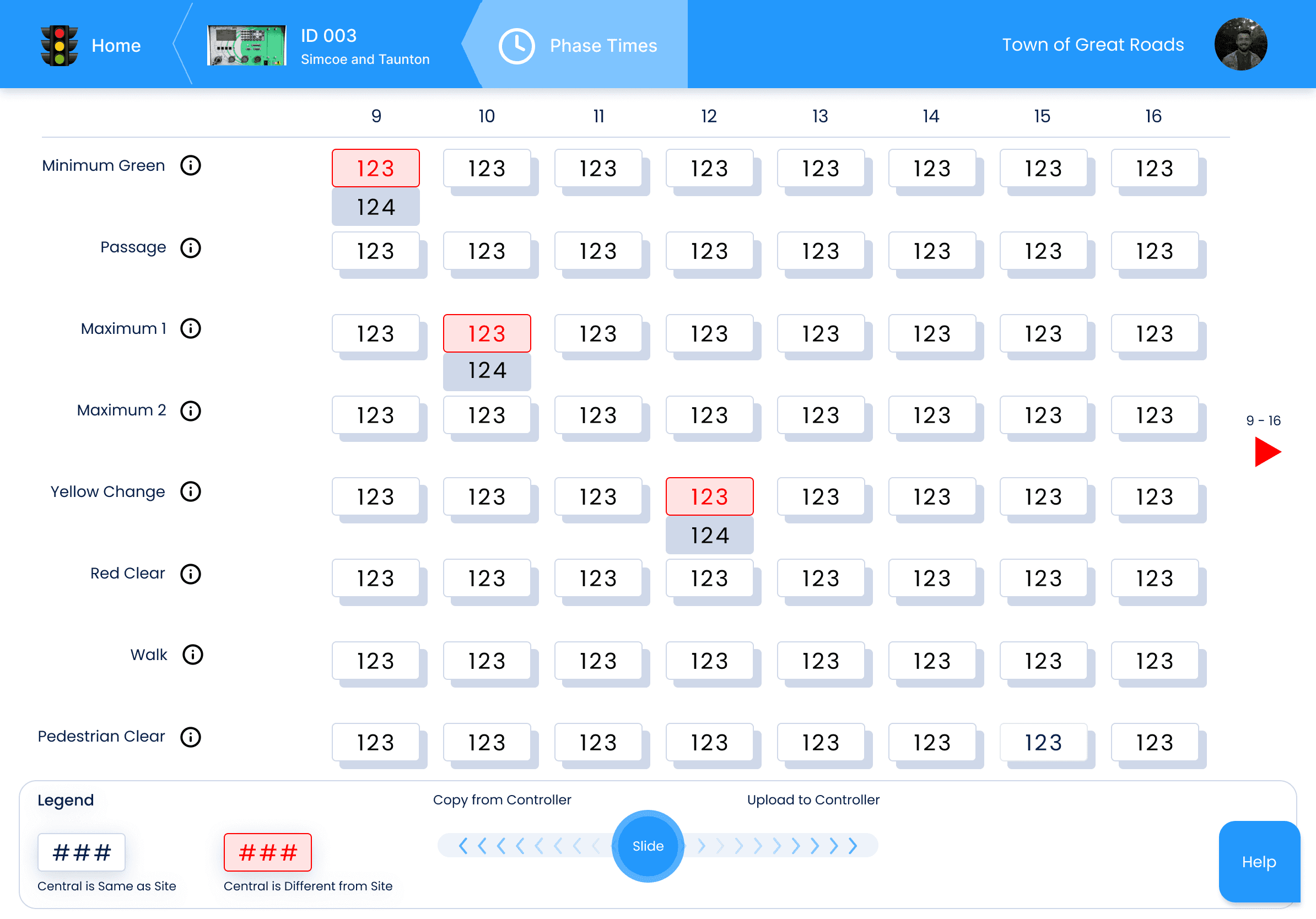
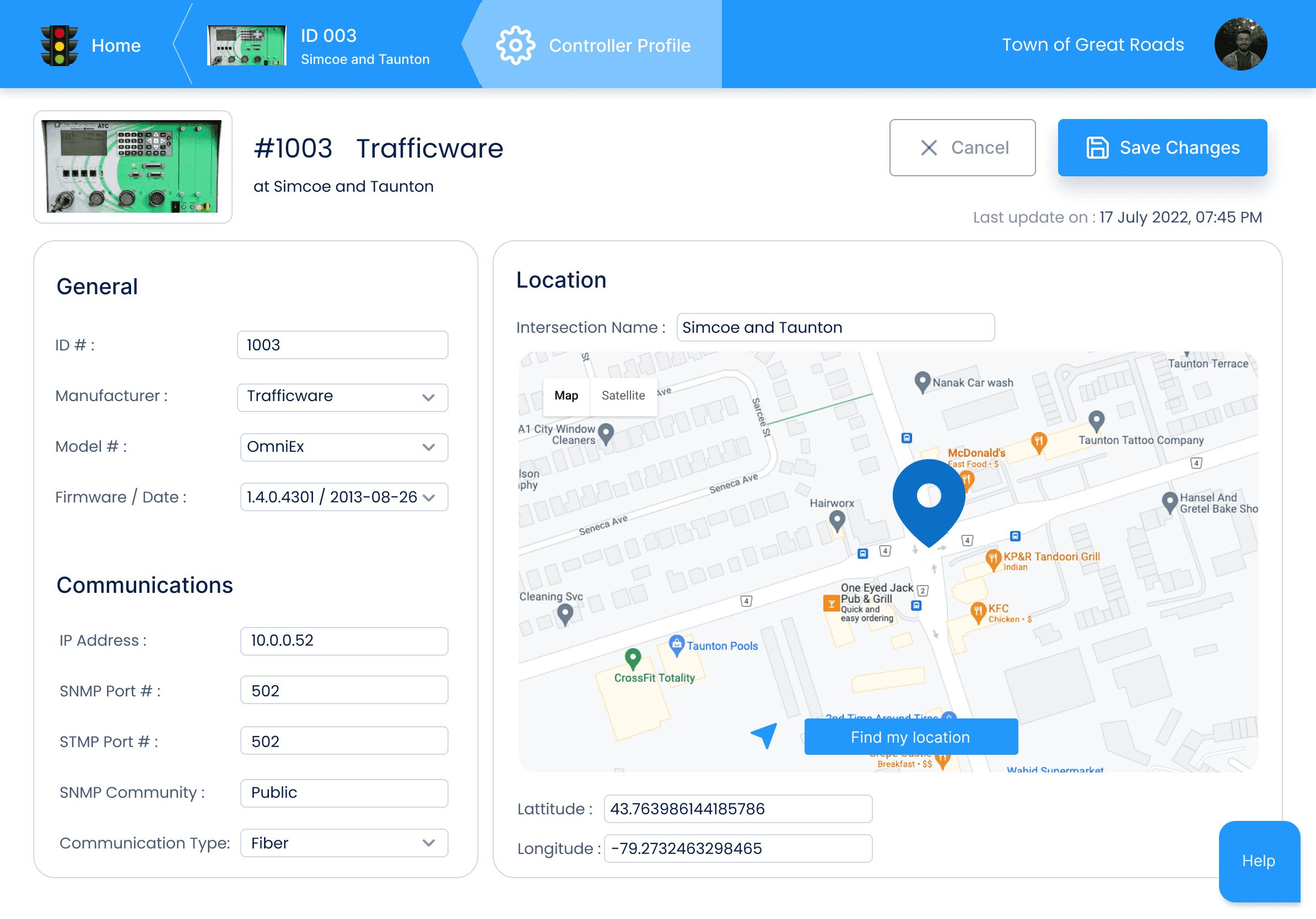
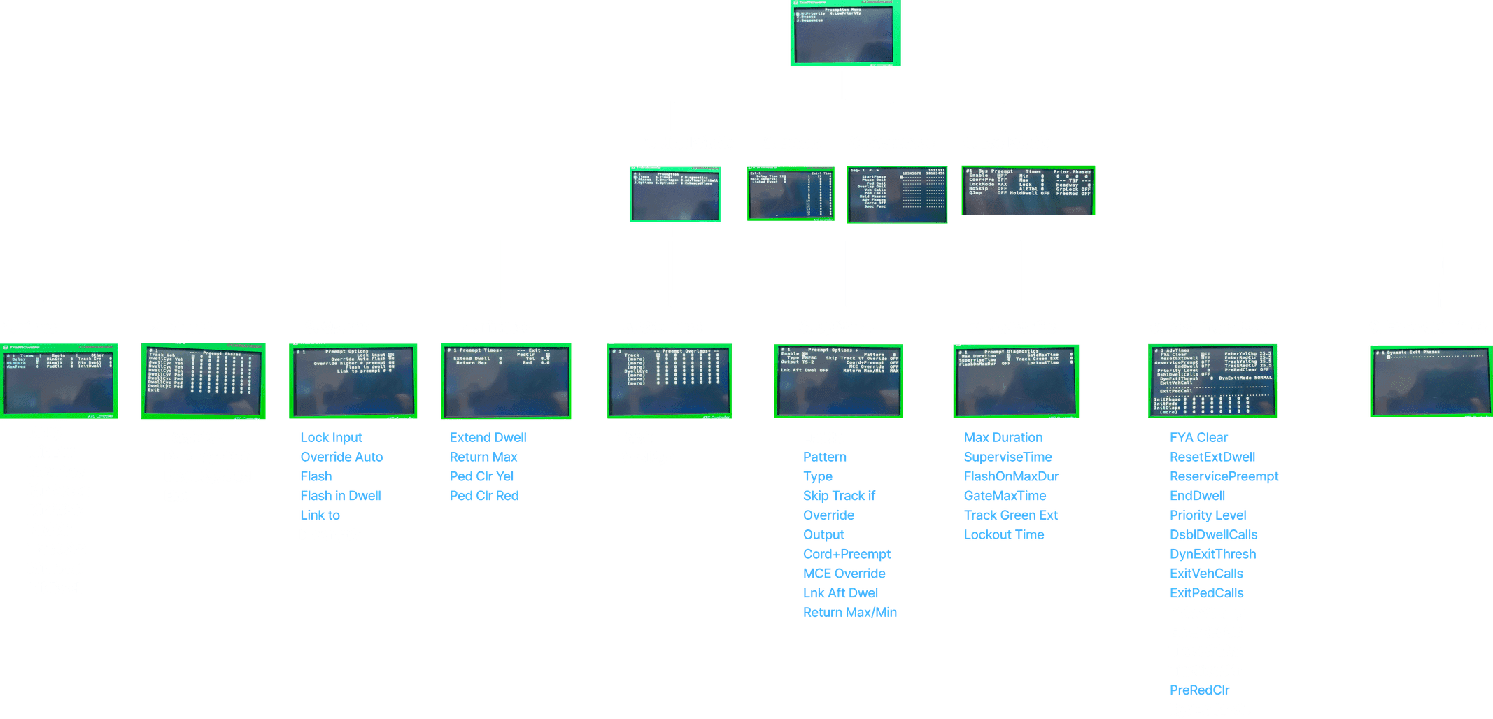
Each module (Controller Profile, Preemption, Phase Times, Phase Options) represented a separate subject area. I studied NTCIP standards and controller behaviour, then mapped real operator workflows and ranked modules by frequency of use and the friction they caused. That ranking told me where to spend effort first and what to postpone.
I didn’t cut anything permanently. I sequenced it: Preemption and Phase Times got design attention first because they carried the highest friction and error risk. Lower-friction additions, like letting operators attach notes to a controller for later reference, followed once the shared framework was proven.
I built a modular framework with a shared skeleton (navigation, layout, states, errors, and rollback) and module-specific logic inside it, so a pattern this simple could sit next to Preemption’s complexity without either one breaking the system.



The problem: Drafts, Data Copy, and Import/Export are common features used in every module.
What I weighed: Contextual placement inside each module would have been more discoverable, since the tools appear where you’re working. But it would mean duplicating the same tools in every module, and each copy could drift.
What I chose: One global section in the app bar. Operators learn where these tools live once, and it’s the same in every module, which keeps muscle memory consistent and removes redundancy from the design and the codebase.
The trade-off: Discoverability. A first-time user won’t stumble on these tools inside a module. I accepted that because operators repeat these actions constantly and consistency pays off faster than discovery.
The problem: Moving configuration to or from a controller was a slow, multi-step manual process. But the risk is real: a wrong push to a live signal is more dangerous than a slow one.
What I chose: A single swipe starts a bulk transfer, replacing the manual process. Speed alone wasn’t the goal, so I designed safeguards around every operation:
Before: a confirmation step ensures the swipe expresses intent rather than a slip. It shows the source, destination, and what will be overwritten.
After: clear feedback on success or failure, plus rollback states so a bad transfer isn’t a dead end.
The trade-off: The swipe is one gesture, but not one step. Confirmation adds a deliberate pause. I accepted that friction because the cost of a mistaken push is far higher than a second of hesitation. Fast to start, safe to finish.
I built the theme file and all the UI components in React, TypeScript, Storybook, and MUI. Building helped me validate the designs faster and make changes accordingly. This hands-on approach not only minimized developer handoff friction but also accelerated the overall development timeline, driving the project toward successful delivery.
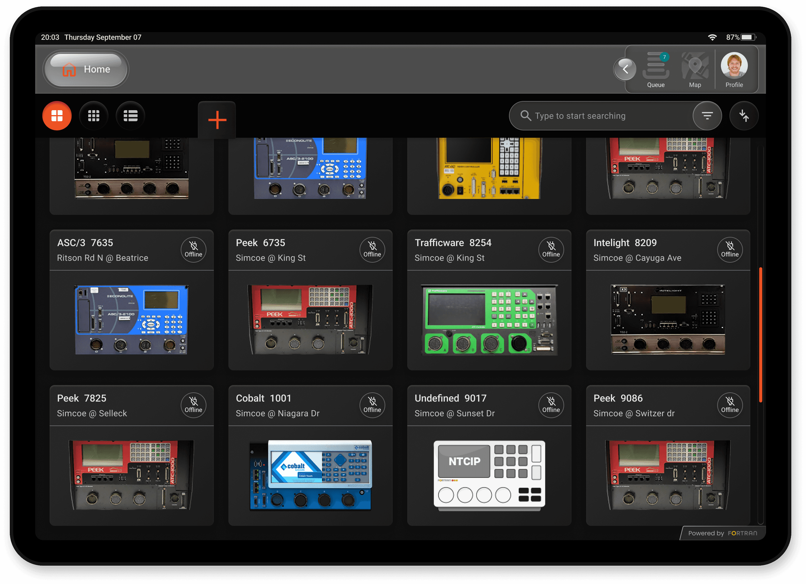
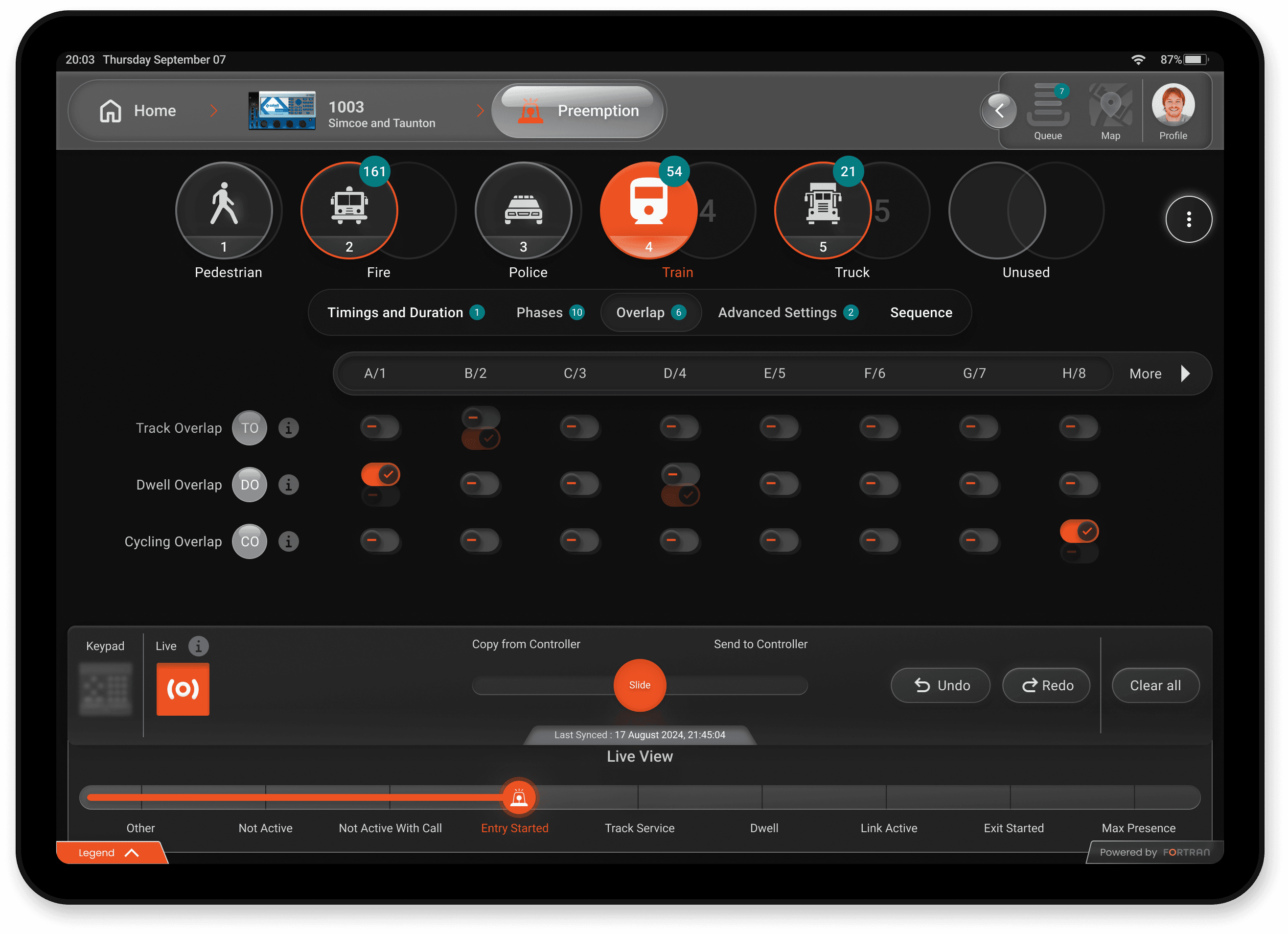
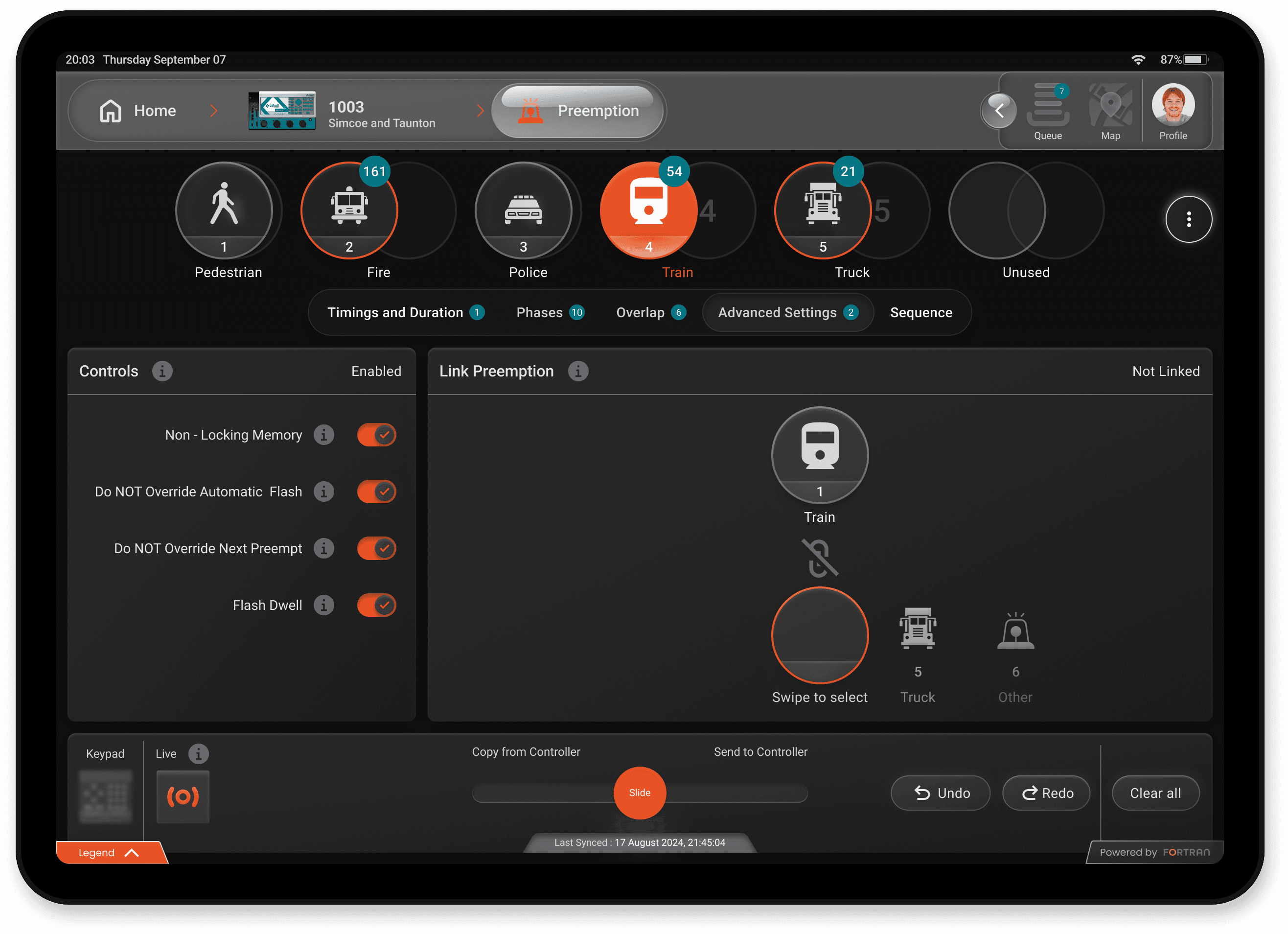
The FENYX app achieved exceptional results, redefining user expectations while maintaining simplicity and usability across a range of controllers.
Winning moments
Overall task success rate: 92% of assigned tasks were completed successfully by operators who participated in testing, with minimal to no guidance.
Average task completion time: 3.2 minutes per task. All seven field operators who participated completed tasks efficiently, demonstrating the app’s ease of use.
Unanimously positive user feedback: Some users were so impressed that they doubted a single interface could work seamlessly for all controllers.
Innovative controller management: The app introduced a fresh and unique way to configure and manage controllers, setting a new standard in the industry.
UX psychology principles: The design combined familiar yet dynamic patterns with slight complexity to engage users through a friendly, intuitive interface, leveraging learned behaviours while encouraging exploration.
LESSONS
Adapting to diverse needs: Addressing a wide spectrum of user requirements reinforced the importance of balancing simplicity with advanced functionality.
Stakeholder collaboration: Managing diverse expectations from engineering, design, and end-users required continuous alignment but drove better results.
Iterate to innovate: embracing iteration and user feedback was critical in refining the design to achieve success across multiple use cases.
Unified experience matters: A single interface for multiple controllers requires innovative thinking but ultimately creates a superior user experience.